Monday, December 8, 2008
Star Plot
Similarity Matrix
Stem and Leaf Plot
http://www.europa.com/~paulg/mathmodels/datacenters.html
Box Plot

This is an example of a box plot. The box in the center of the line represents the middle 50% of the data gathered, with the upper 75th percentile in the upper division of the box and the lower 25th percentile in the lower division of the box. The whiskers, or lines on either end of the box, indicate the highest and lowest data values.
Histogram
Parallel Coordinate Graph
Triangular Plot
 This triangular plot shows the possible fractions of the population that are voting in the general election in the UK. The white circle in the plot represents the current estimate by opinion polls, which looks to be represented as the Labour and Liberal Democrat vote.
 http://ex-parrot.com/~chris/wwwitter/20050407-it_doesnt_matter_how_you_vote_either_way_your_planet_is_doomed.html
Windrose
Climograph
Scatterplot
Index Value Plot
Accumulative Line Graph or Lorenz Curve
Bilateral Graph
Nominal Area Choropleth Map
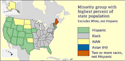
 This is a nominal area choropleth map showing the percentages of minority groups in each state. The data is nominal because is put into categories that cannot be measured or ordered. However, it is still clearly defined through the use of color.
https://courseware.e-education.psu.edu/courses/geog482/policies.shtml
Tuesday, December 2, 2008
Unstandardized Cholopeth Map
 This is an unstandardized cholopeth map of North Carolina. It is a unstandardized choropleth map because there is no specific ranking for any of the classes; the map is unordered. The shades of red and orange are used to distinguish between the survey types.
https://blogger.googleusercontent.com/img/b/R29vZ2xl/AVvXsEh6icC_pygJna0Z3lplkSmttzt6zYu8aq3gfWqcJPWxeVw5gEYgkdaNf2dvG2t1leXvKlqgfYhWfStWP34rqtFtlNokho8WmeKbIBZQ_7fLAlWU51eNDvJdFlltEQ1d0zM0IOtmvDodam9X/s1600-h/untitled.bmp
Standardized Choropleth Map
This is an example of a Standardized Choropleth Map because it measures the population in the United States (Census 2000) per square mile. The shades are purple are also used to illustrate the population; the darker shades representing a higher population per square foot. According to the map, New Jersey has one of the most populated states with the population showing +1000 per square mile.
Univariate Choropleth Map
Bivariate Choropleth Map
Unclassed Choropleth Map
http://esri.com/news/arcuser/1003/files/choropleth.pdf (page 2)
Classed Choropleth Map
Range Graded Proportional Map
Range graded proportional maps depict circles in ranges of data. In this case, the ranges are population of settlements. According to the map, the largest settlement population seems to be East of Parkany.
http://strangemaps.wordpress.com/ (311)
Continuously Variable Proportional Circle Map
DOQQ

This is a grayscale DOQQ image of a portion of Lombard, IL. DOQQ images are computer generated aerial photographs where the displacements caused by the camera and terrain have been removed, and combines the qualities of a photograph with those of a map.
http://www.usgsquads.com/prod_doqq.htm#General%20Information
DEM - Digital Evaluation Model
http://tahoe.usgs.gov/GIS.html
Monday, December 1, 2008
DLG - Digital Line Graph
 Digital line graphs are digital vector representations of cartographic information, such as features from topographic or planimetric maps or Aariel photos. This map illustrates contours, roads, section lines, lakes and streams that were created from a portion of the sample dataset.
http://web.wt.net/~daba/dlg/default.html
DRG - Digital Raster Graphic
Isopleths

An isopleth is a contour line that can be used to map surface elevations, amounts of precipitation, atmospheric pressure, and other measurements that are viewed in 3D in a 2D format. These maps contain an isopleth interval of 10.
http://www.jsu.edu/depart/geography/mhill/phygeogone/isoplth.html

