 Isopach maps, like this one, are used to illustrate stratagraphic thickness of a rock. The red dashed line represents the isopach contour line.
Monday, November 10, 2008
Isopach
Isopach maps, like this one, are used to illustrate stratagraphic thickness of a rock. The red dashed line represents the isopach contour line.Isohyets

Isotachs

This map shows the wind direction and speed through the use of isotachs. The closeness of spacing of the isotachs in the North West portion of the map indicate the intensity of the wind shear in that region.
http://sowmex.cwb.gov.tw/2008/data/model/Operation_CWB-WRF_45km/20080513/model.Operation_CWB-WRF_45km.200805130000.006_700hPa_Hgt_Wnd_Isotach.gif
Isobars

Isobars are contour lines of equal pressure on a weather map. Each line passes through a pressure of given value. Isobars, as seen in this map, pass through atmospheric pressures of 1000 + 4 or - 4.
Tuesday, November 4, 2008
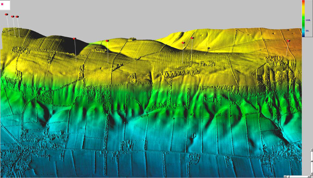
LIDAR

Doppler Radar

This is a Doppler Radar of the United States. In the map, color illustrates reflectivity. According to the National Weather Service, rainfall is shown when the DBZ is at 20 (green) or higher. Which would show rainfall in the Northern United States, including Northern Minnesota, and the East Coast.
Black and White Aerial Photo
 This is a black and white aerial photo of Washington, DC in 1949. Because this photo is in black and white, it shows approximately the same wavelengths that are visible by the human eye. However, if IR film were used, the gray areas may have been more distinguishable.
http://eros.usgs.gov/products/aerial/historical.html
Infrared Aerial Photo

This is an infrared aerial photo of part of Osceola County, Florida. The photo uses IR imagery, which produces the red coloring, to show the wavelengths that are not seen by human vision. One can also notice that the land and water contrasts are more pronounced than a black and white aerial photo.
http://eros.usgs.gov/products/aerial.html
Cartographic Animation
This map, using animation, shows the history of the United States. Through shading and coloring, it displays ownership of land in the United States throughout history, as well as population. The population is shown through raised data.
Statistical Map

 This statistical map shows the median age of the total United States population. The median estimated age is 36.4 years old. This is also a thematic map, which uses color to represent the data in each metropolitan area.
(From the "People" Column, Select "Median Age:2006).
Cartogram

This map is an example of a cartogram. This map shows the size of the nation by the amount of goods they sell in Walmart (as of 2001). According to the map, 46% of the goods sold in Walmart come from China, which is displayed through its projected size as a nation.
Flow Map
 Flow maps are used to show the movement of objects from one location to another location. This is a map of the King County International Airport and surrounding area. The red and blue lines are used to show the flow of flights in and out of the airport.
http://www.metrokc.gov/airport/pilots/fly_quiet.stm
Isoline Map
.png)
Isoline maps are a 2D represenation of a 3D map, through the use of contour lines. The bottom map uses contour lines to illustrate the elevation of the top image. The tops of the hills are shown in 2D through the circular contour lines. This map was taken from http://commons.wikimedia.org/wiki/Image:Contour_map_(PSF).png.
.png)
Proportional Circle Map

Proportional Circle Maps display data in relation to size the size of the circle. This map shows the Filipino population in the Southern United States in 2000. Through the size of the circles one can see that Texas has the largest Filinpino population.
http://www.neiu.edu/~ejhowens/377/examples.htm (Select Filipino Population.)
Choropleth Map

Choropleth maps are themetic maps that allow the visualization of statistical data pertaining to a geographic region. The above choropleth maps show the crime rates in the United States and 2004 Election Results. The shades of pink and red coloring are used to illustrate the data. This map was taken from http://www.geog.ucsb.edu/~jeff/gis/choropleth_maps.html.
Subscribe to:
Comments (Atom)